Former DAE student Hella Jongerius has received the Sikkens Award 2017 for her extensive research into colour
Previous winners of this prestigious prize, which is sponsored by the multinational Akzo (known for its paints), include David Chipperfield (2015), John Cage (1997), Adriaan Geuze (1995), Donald Judd (1993), Reinbert de Leeuw (1991), Luciano Fabro (1987), Benno Premsela (1985), Ettore Scola (1983), Theo van Doesburg (1968), Johannes Itten (1965), Le Corbusier (1963), Gerrit Rietveld (1959), and many other great talents from the cultural field.
Hella Jongerius graduated from Design Academy Eindhoven in 1991. Since then, she has built a strong international career. She has become known for her researching attitude and the intriguing ways in which she infuses the industry with the qualities of craftsmanship. Jongerius works for various international commissioners, she is an art director for renowned companies like Vitra and Danskina, and her work is part of many international museum collections.
Many former DAE students work with her, either in her Berlin-based studio, or in the Netherlands (see the list of collaborators below). Since the early years of her career Jongerius has collaborated with theorist Louise Schouwenberg, head of DAE’s Master program Contextual Design. In 2015 the two released the Manifest ‘Beyond the New’ during the Salone del Mobile in Milan. In 2016 they presented the shadow play ‘A Search Behind Appearances’ during the Salone of that year. Both presentations are pleas for more ideals in design.
Speech Hella Jongerius gave on the occasion of the Sikkens Prize reward ceremony:
I feel like an absolute beginner when it comes to colour. Even though I have learnt a great deal about colours, I still can’t really get my head around the subject. Colour is one of those truly wonderful subjects that will always keep you feeling like a beginner. It is this quality that makes colour so worth it (just like life itself).
Astronomers often say – when they have acquired some new viewing equipment – that their new insights have made them realise even more how little they can see. That is how I feel lost in colour. With every book I read about it, with every test we perform. With every dye we mix, every test to the light, I realise we know so little.
And so, receiving an award is a blessing. It is a confirmation that I am on the right track. Thank you for the recognition.
For the first three years of my career I created products made almost exclusively of a single material: Polyurethane, better known as rubber. My fascination with rubber lay in trying to find a new skin. A new appearance for plastic. It’s a material that is mostly known as something that is young and hygienic. I wanted to instil the polyurethane with traces of the craftsmanship that went into making it. A research into the beauty of the ageing of a surface, aiming to give the products a longer lease of life. I wanted to create antique plastics, as it were.
After a while, I felt I had done everything there was to be done with plastics. So I started focusing on ceramics. Trying to capture an individual quality that could be serially produced. Working with Jan Tichelaar at Makkum I created a series of tableware and vases. The word ‘imperfection’ was still taboo at the time. But now, after all these years, imperfection, craftsmanship and authenticity are the perfect bait used by every marketing department.
Later still, I turned my attention to textile and tapestries, in similar ways. The final instalment in the series was COLOUR. A focus that collided with my taking on the role of art director at Vitra in Basel, more than 10 years ago.
I am telling you the story in this particular order to make it clear that I have always approached colour as a material, like the others. And that is how I see it to this day; for me there is no real distinction between a material and a colour. I’m sure physicists will disagree, but for me, colour and material have the same quality.
Let me just pursue this equation of colour and other materials for a while. The ceramics industry is comprised of countless factories: for bigger and smaller numbers, for higher and lower temperatures, in developing countries and in rich countries.
Things are very different in the colour industry: the market for paint varnishes is occupied by a few very big players, and Akzo Nobel is one of them. There is only a handful of small, traditional factories that do something else besides the mainstream, and hardly any in developing countries.
The colour industry is part of the chemical industry, and it is just a matter of course that things are done in bulk within this branch. So the relationship between craftsmanship and industry is radically different for this product.
Another difference between colour and other materials is that it is so closely interwoven with art history. Various pigments have been developed simultaneously with certain movements in art. There is no time to address this in a more in-depth way here, but I do often take my inspiration from art history. In my experience, there is science hidden in these cultural layers of colour. The light, the research into various temperatures of light, and the way the eye works.
Colour also has a philosophical component, starting with Plato and the shadow world. To me, the shadow is the queen of colours. Like Plato, I have become convinced that people can only observe a colour if they can observe the light, the reflection and absorption, and the shadow of it. No wonder then, that people can get lost in colour.
To me the material, colour, is a multi-layered cultural vehicle.
Since you are honouring me for my “activist work attitude”, I feel justified in adding a little bit of a sting to my words now. I would like to compare the supply of pigments and colour varnishes to the food industry. There are some major changes underway in the food industry. A growing group of consumers no longer wants to eat industrially produced foods. Pressure from the market is causing Unilever to slowly take out the sugar and salt from its pre-packaged foods. You have all been able to read about it: recently, every last lump of sugar was taken from Sprite lemonade. So what in heaven’s name is left in the bottle, you’d think.
We no longer want it. Unfortunately, I am not discerning a similar trend within the colour industry. Most customers seem satisfied with what is on offer.
Not me.
I miss the dash of red in (most) industrial recipes for green, that gives the colour its intensity, its life. I miss colours that breathe with the changing of the light. That could, for instance, respond as an antidote against the white lights from the computers we work with. I miss the de changeability, the options, that will allow us to read and re-read an industrially produced colour, like we do with works of art.
I want to make a plea for an in-built ageing process. Because we know that there is a big market within the furniture industry for vintage pieces, whose greatest attraction is precisely this, their patina, the symptoms of ageing.
I want to make a plea for embracing metamerism. For colours that respond, and that will allow being influenced by the nature of the light hitting it. As a designer, and as an art director, I want to make a plea for intense, layered pigment recipes, for plastic granules, varnishes and powder coats.
I want to make a plea for different ways of making colours lighter or darker than adding carbon black and titan white. One simple change like that will change the whole colour range; just think of all the different intense shades of grey that will be possible.
‘Why,’ I hear you thinking. Why do I want to introduce these qualities into the industry? Because we as designers have the responsibility to make the world a better place. The industry is the only party with the power to reach groups of users. There is no point in me as a designer making something beautiful for only a small group of fellow believers. My work acquires true meaning when I use my talents to make a difference for a large group of users.
Why should I have to convince the industry to add more quality to their production of colours? Because in their view this is a niche market, too small and thus too expensive to go forward in. But it is important! The objects and materials we surround ourselves with on a day-to-day basis shape our world, and they shape our humanity. They reflect who we are, or who we want to be. Design says something about the world we live in. Design says something about us. That is why, as a designer, I feel responsible. And that is why there is no stopping me.
Let me be clear on one thing: you are looking at a thankful person. Yours is a wonderful foundation with a wonderful jury and a wonderful award from a wonderful company.
When I received this award I felt honoured, especially because this is not an ‘ordinary cultural award’. This is an award that comes from the heart of the industry, its current main sponsor is Akzo Nobel. How great that a business is supporting a cultural cause! And that human society is such a priority for the company.
But I’m sure you will understand by now. My first aim in life is not to collect awards. I want to influence the industry from my position as part of it. And so I thought: ‘you know what? I am pitching my idea to this packed room this afternoon.’ After all, the occasion couldn’t be more fitting. Everyone is here, it’s a Sunday, we are all in a good mood.
Of course I have tried before, but nobody took an interest on that occasion. I sensed that people were slightly wary of me. I might disrupt the machine too much. Well, yes. That is right; prize winners can be very upsetting.
But perhaps they will have changed their minds, you never know. Is it allowed, during an acceptance speech? Pitching? I was careful and I looked it up. And yes, pitches during acceptance speeches are allowed. And so here goes:
Hello, my name is Hella Jongerius. I would like to create an industrial black without using any carbon black pigment. The industrial soot is effective, but it stops a colour from breathing, it kills it. We could also make the most awesome chromatic greys in the same way. Who wants to join me in making unstable colours with depth, that will age beautifully, like people do?
Thank you for our attention. I look forward to receiving your emails!
Right! That was that. And now for something completely different:
Ladies and gentlemen: of course I don’t work alone. I am blessed to have a large group of wonderful people around me. I would like to start by mentioning a few who have been instrumental in my development: my colour teacher at Design Academy Eindhoven, Mathieu Meyers, a great teacher to whom I owe so much and who is still an inspiration. Katrin Trautwein, a headstrong girl from Zurich, or you could say: an activist type, a manufacturer of colours who has taught me an incredible amount. I would not only like to thank people from the design profession, but also, for instance, my financial adviser, John Jongerius. He has plotted a financially healthy course for Jongeriuslab that has given my cultural mission true power to strike. The next person I’d like to thank is Louise Schouwenberg, whose keen mind and sharp pen have given my work depth and opened my mind. I hope that for many years to come you will do the words, while I do the objects!
I see so many familiar faces here today, all these people who have shared their energy and their talents with me. I am very grateful to each of you. Without your loyalty and your talents I would not be standing here.
Allow me to invite the team that currently works with me to join me on the stage, to accept this fantastic award with me: First of all, may I invite my main companion at the office, the captain of the ship: Siska Diddens. Many thanks for your enormous loyalty. Without you I could never have worked like this.
Now I like to invite the colour and textile team. My right hand Edith van Berkel. Together we embarked on the colour journey many years ago. Thank you for the incredible spirit and designtalent you have brought with you. Our colour and textile signatures have blended into one. Brigitte Dallmeijer, who’s the best weaver of the world. I feel honoured that you share your skills and talent with me.
Then the Frauenteam aus Berlin: many thanks to modest but super powerful Marjolein Houben, who’s designing capacities are now in full bloom. Then there’s the woman who silently solves all problems and takes care of our wonderful lunches: Lauren Walter. Many thanks also to Laura Fügmann and Sarah Meyers. You have wonderful talents, I can blindly trust your intelligent hands.
And then there are the men of my studio. First of all my other right hand Arian Brekveld. We collaborate already for more than twenty years, it feels like we have a whole life together. I am deeply grateful that you share your talent and loyalty with me! I feel honoured, many many thanks. Then there’s Claus Wiersma, the best exhibition designer of the Netherlands, many thanks. I’m also lucky to have three very talented and very handsome young boys around me: Sander Manse, the ambitious clever guy with the wild mind who’s an excellent writer. Special talent Jos Klarenbeek, the clever whizzkid, who combines cleverness with a beautiful poetic handwriting. And finally Wesley de Boer, the new kid on the block, who just graduated in Eindhoven and now works here with me in Berlin.
And finally, finally, before we all take our bows to accept the award: A big, big thank you to Lucas Verweij. Behind every successful woman, there is a strong man. Your jokes offer me the light touch and the air to breathe that I need, and without the wise sounding board of your countless pieces of good advice I would never have made it all the way up here! Hamer and Griet, my children, I’d like to invite you up here. Just because I love you. Let’s all join in accepting this award, let’s all take a bow.
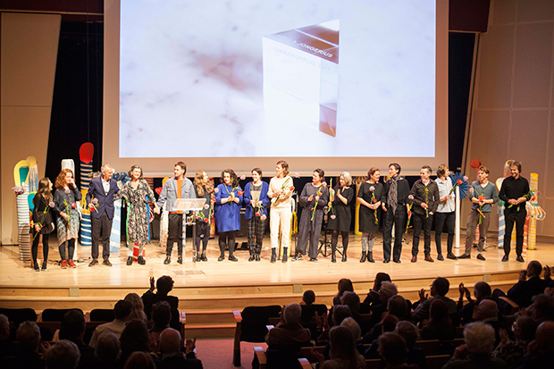
Image: The Jongeriuslab team on stage. From left to right (the names with asterisks are former DAE students):
Griet Verweij, Hamer Verweij, Lucas Verweij*, Hella Jongerius*, Wesley de Boer*, Laura Fügmann, Sarah Meyers, Lauren Walter, Marjolein Houben*, Iris Toonen*, Brigitte Dalmaijer*, Edith van Berkel*, Siska Diddens, Claus Wiersma*, Sander Manse*, Jos Klarenbeek*, Arian Brekveld*